|
|
Post by AshVersion2 on Aug 8, 2006 16:19:15 GMT -5
Thanks, both of you!
|
|
|
|
Post by Angie on Aug 8, 2006 17:39:57 GMT -5
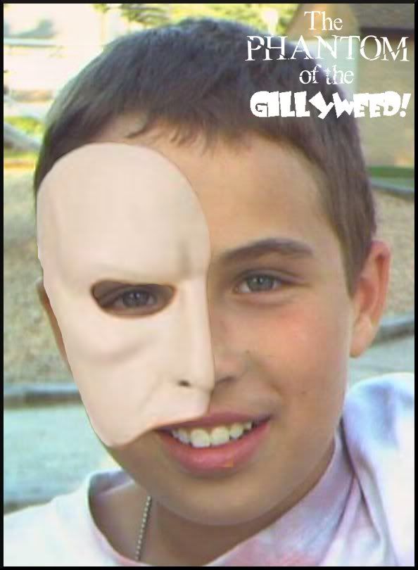
1.) It gets a little fuzzy (like a bad quality photo or something) in most places. This might have something to do with the blending (lowering the opacity of the layer isn't your only option, dear).
2.) The text is hard to read.
Other than that, it's pretty good.
|
|
|
|
Post by AshVersion2 on Aug 9, 2006 6:38:14 GMT -5
*bows to the Master*
|
|
|
|
Post by AshVersion2 on Aug 10, 2006 9:45:06 GMT -5
Sorry, I never get over this:  ;D |
|
|
|
Post by Angie on Aug 10, 2006 16:38:01 GMT -5
Haha, I love it! ;D
|
|
|
|
Post by AshVersion2 on Aug 11, 2006 14:54:17 GMT -5
As you should - it combines your two fave men, no? ;D
|
|
|
|
Post by Angie on Aug 11, 2006 15:01:15 GMT -5
Exactly. *hugs the picture* ;D
|
|
|
|
Post by AshVersion2 on Aug 11, 2006 15:21:11 GMT -5
You should print it out and put it on your wall. ;D
|
|
|
|
Post by Angie on Aug 11, 2006 15:23:47 GMT -5
Lol, and have my mom think I'm even weirder?  |
|
|
|
Post by AshVersion2 on Aug 11, 2006 15:24:59 GMT -5
So?
|
|
|
|
Post by AshVersion2 on Aug 18, 2006 14:26:14 GMT -5
|
|
|
|
Post by AshVersion2 on Aug 19, 2006 15:26:38 GMT -5
|
|
|
|
Post by Donald Duck on Aug 19, 2006 15:28:59 GMT -5
lol
|
|
|
|
Post by AshVersion2 on Aug 19, 2006 15:29:46 GMT -5
Maybe I'll make a hobby of it. ;D What did you think of the 'Mr. Butler' one?
|
|
|
|
Post by Gil Alexander on Aug 19, 2006 15:49:20 GMT -5
Lol, nice, Ash ;D
Woah, the font on the Mr. Butler one makes the M look like a jellyfish!
|
|