|
|
Post by skittlestiger on Aug 19, 2006 16:15:19 GMT -5
oy, the phantom one is hilarious!! -and suprisingly well done- good job!!
|
|
|
|
Post by AshVersion2 on Aug 20, 2006 7:15:39 GMT -5
Thank ye kindly, one and all!
|
|
|
|
Post by AshVersion2 on Aug 21, 2006 9:27:27 GMT -5
|
|
|
|
Post by Donald Duck on Aug 21, 2006 15:07:11 GMT -5
yer good at this Ash!
|
|
|
|
Post by AshVersion2 on Aug 21, 2006 15:08:52 GMT -5
Thanks, DD! It kinda makes up for now being able to draw, lol!
|
|
|
|
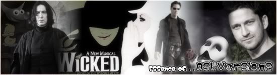
Post by Angie on Aug 21, 2006 16:25:28 GMT -5
That's an odd font. . . Kind of hard to read. And it doesn't really fit.
|
|
|
|
Post by AshVersion2 on Aug 22, 2006 4:03:09 GMT -5
I know, but it was the only one I had that looked half decent.  |
|
|
|
Post by AshVersion2 on Aug 30, 2006 15:29:16 GMT -5
STEVEN'S FACE!!!!!!!!!!!!!!!!!!!!!!  |
|
|
|
Post by Angie on Aug 30, 2006 18:27:55 GMT -5
Lol! It should be his avatar! ;D
|
|
|
|
Post by AshVersion2 on Aug 31, 2006 8:01:47 GMT -5
Excuse me while I do that. ;D
|
|
|
|
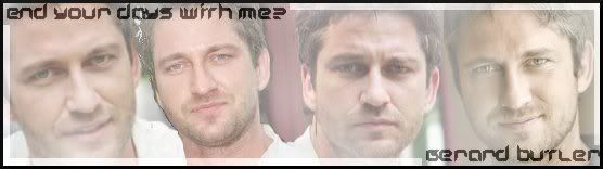
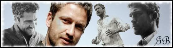
Post by AshVersion2 on Sept 11, 2006 15:09:27 GMT -5
A very quick one. 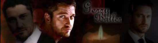 |
|
|
|
Post by Angie on Sept 11, 2006 17:16:07 GMT -5
1.) It's a too dark; you should probably try to give it a more "romantic" feel than just a dark feel. 2.) The blending on his face on the left one isn't right. 3.) The middle pic contrasts in brightness too much to the rest of the banner. 4.) The text is too fuzzy or something.  Plus, you need to go into your settings on the text tool and change the line spacing because it's overlapping. |
|
|
|
Post by AshVersion2 on Sept 12, 2006 10:16:12 GMT -5
(I made it overlap) Cheers.  |
|
|
|
Post by AshVersion2 on Sept 14, 2006 15:12:16 GMT -5
|
|
|
|
Post by eakyra on Sept 22, 2006 0:43:47 GMT -5
Ooo I really like that one. Someday im going to have a contest between you and Angie, making the same banner, but see who makes it better.  Wouldnt that be fun? |
|


 Wouldnt that be fun?