|
|
Post by skittlestiger on Jul 13, 2006 22:35:07 GMT -5
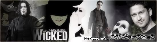
heya, after all the cool banners, I wanted to try making one myself!!  |
|
|
|
Post by Gil Alexander on Jul 13, 2006 22:42:52 GMT -5
Hey, that's pretty cool. A bit abstract, even. Nice job  |
|
|
|
Post by Angie on Jul 13, 2006 23:22:07 GMT -5
1.) You need to get rid of the white dots around the cut-outs. 2.) Make the text a tad easier to read. Other than that, nice job. |
|
|
|
Post by skittlestiger on Jul 14, 2006 8:02:34 GMT -5
yay! thanks angie and gil!!!  Hows that? (I left in a little of the white for effect, me thinks it looks a little cool, but I changed the text color, and got rid of some of the white is it better?) |
|
|
|
Post by AshVersion2 on Jul 14, 2006 10:00:27 GMT -5
Me likes it.
|
|
|
|
Post by skittlestiger on Jul 14, 2006 12:13:24 GMT -5
yay, thanks Ash! -dances-
|
|
|
|
Post by Donald Duck on Jul 14, 2006 12:15:30 GMT -5
I like it. It's cool!
|
|
|
|
Post by Angie on Jul 14, 2006 12:22:21 GMT -5
yay! thanks angie and gil!!! Hows that? (I left in a little of the white for effect, me thinks it looks a little cool, but I changed the text color, and got rid of some of the white is it better?) Well, I don't see a new image. . . But if you keep the text the dark red, it needs a white outline (duplicate text layer, Layer > Transparency > Alpha to Selection on the bottom one, Select > Grow, fill with white). The reason I say to get rid of the white is because it makes it looks like you did it on accident, as that is a common look of sigs from beginners. By the way, did you use the gimp to make this? |
|
|
|
Post by skittlestiger on Jul 14, 2006 16:44:18 GMT -5
regular paint!
|
|
|
|
Post by Angie on Jul 14, 2006 16:52:39 GMT -5
Lol, wow!
|
|
|
|
Post by skittlestiger on Jul 15, 2006 8:32:33 GMT -5
yay! I got a wow! -dances- I made a second one... is it stretching out the sig, because it is on my comuter, I really dont know what's wrong with it cause I resized it and everything...
|
|