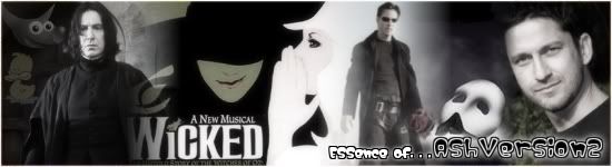
Post by Angie on Jun 7, 2007 12:08:25 GMT -5
I have always had trouble making decent-looking avatars. Yesterday, for the benefit of my website (which offers graphics in its media section), I decided to try to change that with a little bit of practice. How did I improve my style? I found websites with a bunch of cool avatars on them and based a lot of techniques off of what I saw there. Here are some ideas to help you take that great concept and great base image and turn it into a great avatar. ^_^
Oh, and by the way, I'm not going to baby you with super specific instructions, so this tutorial is kind of useless if you don't know your way around the GIMP. . .
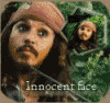
*Create a new image that is no bigger than 100x100, as that is the limit on most sites.
*Paste your base image, and scale it to the right size.
*You could have the image cover the whole space, but in order to show you certain techniques, I am going to crop it to be smaller than the image and fill the rest of it with a color. Make your choice.

*Kind of boring, eh? Well, that's where this tutorial comes in, isn't it? ;D
*One thing I'm going to do is add some borders. I don't always put borders on avatars because it sometimes makes it look worse, but this one is going to look good with it because it's going to be a sort of "theme".

*Now I'm going to stop and do some image enhancing because my base image looks a little too dark for the avatar. In this particular instance, I did screen layers and overlay layers of the original image at various opacities to give it some brightness and contrast.

*One technique I am going to use on this avatar is artistically placed lines. It adds interest and flow, and it can also be a base or divider for text.

*White is kind of boring, don't you think? I'm changing the layer modes for the white lines.

*Before I continue, I must teach you a little lesson: don't be afraid to experiment or change what you've already done. I am going to make my borders wider.

*I've decided I'm not a huge fan of the orange - it doesn't quite match the picture. I'm going to pick out a browner color from the base image instead.

*Text is almost always one of the last things I do. To keep with the theme, I am going to set the layer modes similarly to the line layers and use a pretty sleek-looking font.

*Is it done? You could consider it done, yes. I, however, love to make a million different variations of every avatar I make, so here are some more ideas. ;D


Wow, it's been so long since I made a tutorial, I feel so rusty. Fe2O3 to the millionth degree.
Anyway, if I end up making a second part to this, I'll do some stuff with paths and patterns, probably. . .
Oh, and by the way, I'm not going to baby you with super specific instructions, so this tutorial is kind of useless if you don't know your way around the GIMP. . .
*Create a new image that is no bigger than 100x100, as that is the limit on most sites.
*Paste your base image, and scale it to the right size.
*You could have the image cover the whole space, but in order to show you certain techniques, I am going to crop it to be smaller than the image and fill the rest of it with a color. Make your choice.
*Kind of boring, eh? Well, that's where this tutorial comes in, isn't it? ;D
*One thing I'm going to do is add some borders. I don't always put borders on avatars because it sometimes makes it look worse, but this one is going to look good with it because it's going to be a sort of "theme".
*Now I'm going to stop and do some image enhancing because my base image looks a little too dark for the avatar. In this particular instance, I did screen layers and overlay layers of the original image at various opacities to give it some brightness and contrast.
*One technique I am going to use on this avatar is artistically placed lines. It adds interest and flow, and it can also be a base or divider for text.
*White is kind of boring, don't you think? I'm changing the layer modes for the white lines.
*Before I continue, I must teach you a little lesson: don't be afraid to experiment or change what you've already done. I am going to make my borders wider.
*I've decided I'm not a huge fan of the orange - it doesn't quite match the picture. I'm going to pick out a browner color from the base image instead.
*Text is almost always one of the last things I do. To keep with the theme, I am going to set the layer modes similarly to the line layers and use a pretty sleek-looking font.
*Is it done? You could consider it done, yes. I, however, love to make a million different variations of every avatar I make, so here are some more ideas. ;D
Wow, it's been so long since I made a tutorial, I feel so rusty. Fe2O3 to the millionth degree.

Anyway, if I end up making a second part to this, I'll do some stuff with paths and patterns, probably. . .


 ;D
;D